
A new brand identity for the Proptech market
Client
- Housiter
Industry
- Real Estate
Skills
- Brand strategy
- Business design
- Research
- Visual design
- Visual identity design
Team
- 2x Product designer
Date
- 2019-2020
Towards the digitalisation of the real estate sector
Increasingly, there is a proliferation of platforms dedicated to Proptech, a model that refers to the real estate business in the digital sphere. This model aims to revolutionise the sector and transform services that are offered in the traditional way.
Faced with this digital transformation, new businesses have emerged that give us the opportunity to remove obstacles so that the sale and purchase of real estate is simpler and more convenient.
Housiter is committed to this digitalisation strategy and has therefore enlisted the help of Secuoyas to create a visual brand identitythat adapts to the digital medium, with the challenge of simplifying real estate investment in profitability, in the most efficient way, with full security and quality guarantees for investors.
A name based on its values
In collaboration with the client, we conducted naming workshops that focused on representing the three basic concepts of the business: houses, fully renovated and cared for, honesty and quality.
Thus Housiter was born, a name aligned with the objectives and values of the brand, scalable and registrable.
Moreover, with the naming we also reinforce the services offered by the company: "We take care of everything and you don't have to worry about anything".
What is more honest than leaving your home in someone else's hands?


Building brand identity
To develop the identity, we carried out research and subsequent analysis through collaborative sessions with the client, where we observed other companies in the sector and defined the strategy and business model.
We assessed the needs and preferences of investors and users, which helped us to build a narrative to provide attributes to the brand, such as the close relationship with customers based on trust and the importance of added services that give them peace of mind and security.
In a second phase, we focused on researching and creating the identity that allowed us to define the brand's mission, vision, tone of voice, personality and promise. We also extracted their differentiating values and developed their strategy in order to create a coherent identity for the business.
A deep dive into real estate sector trends and the use of a mind map, as a tool, helped us a lot to order and organise the ideas to connect all the attributes that we wanted to reflect in the identity.

A concept, Le Corbusier as a reference
We have created an identity that reflects the strategic work carried out previously. For this reason, we opted for a simple, typographic and carefully detailed brand to transmit quality and design.
The logo has been built based on very constructive and industrial elements, influenced by Le Corbusier.

Le Corbusier, considered one of the most influential architects of the 20th century, stood out for his urban and rational architecture, with geometric shapes and right angles. For Le Corbusier, a home must be functional and satisfy the needs of its inhabitants, premises that we have reflected in Housiter's brand identity.
A flexible and strong brand
In the construction of the logo, special attention has been paid to the simplicity and spacing of the logo based on an architectural approach.
Housiter's identity has been designed to be adaptable to different media, both physical and digital, allowing the identity to be flexible and functional in its application.
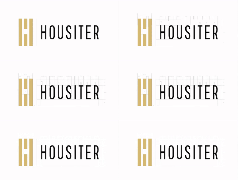

The symbol
The brand strategy is therefore reflected in a very geometric logo, with sharp angles and straight lines that provide the security that investors are looking for.
In its chromatic palette, through the implementation of blue, we transmit confidence and honesty, main values, which we combine with the colour albero, alluding to the wood tones of the materials and the quality of their homes.

A very defined photographic style


The universe of Housiter
Based on the development of the visual identity, we defined the brand's applications and points of contact. The graphic system created allows us to combine the elements of the identity in different media, both digital and physical.
We design different types of applications, from corporate stationery, brochures, RRSS or large communication formats.


To transmit Housiter's concept to its customers, we have developed a corporate communication aligned with its values and product.
In addition, we have created an identity and communications manual, which defines the structure of the elements and the visual style.


Factual session

Definition Workshop

Mind map branding

Mind map naming

